top of page


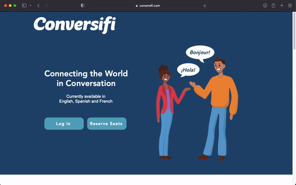
Website Rebranding and Improved User Experience
Position: UX/UI Design
Summer 2021
3 Months
Solo Project
I was asked to
Rebrand Conversifi's Website with a user centered design.
My solution
I researched different user scenarios, competitive analysis and branding and used my findings as a basis for the updated site.
Impact
This resulted in a website which is more user friendly and easier to understand for users. I also helped the client find more consistent branding with a style guide.
Iterative Design Process
1.
Design Process Proposal
2.
Website and User Research
3.
Proposed Solution
4.
Cartoon Illustrations
5.
Final Update and Branding
BONUS Design Sprint

2.
Website and User Research
User Analysis and Hierarchy Research
In order to create the best possible website for the user, we wanted to figure out the hierarchy for each user. So, some users might prioritize Conversifi’s background, while others might be more interested in jumping into the video calls. So, we made a google spreadsheet in order to communicate our priorities.
Competitive Analysis
In my designs, I like to look at other designs to see what worked and what didn’t work. So, I looked at three big language websites to see how they approached their homepage and similar pages that Conversifi needs.


Conversifi Branding
One assignment I was given was to consider redoing the Conversifi style guide. The guide is a great start to their branding, but I believe it could benefit from some changes.
I took some aspects from their site and began thinking “how can I communicate and structure the brand?” Through talking with the CEOs, I have picked up on what works for them and what could be improved. So, I started my research document in order to solidify what works and build off of that.
User Scenario Flow Chart and Website Flow Chart
Figma

3.
Proposed Solution
Photoshop
I designed the website as a draft based on all the information I had researched on the Conversifi brand. users and other successful sites. I presented this draft as an idea for my team to see what I was going for with the vector cartoon art, and the color schemes. I thought of the users while organizing the sections under the banner and tried to prioritize what would be the best flow for the users.


Design Process Proposal
Website and User Research
Proposed Solution


5.
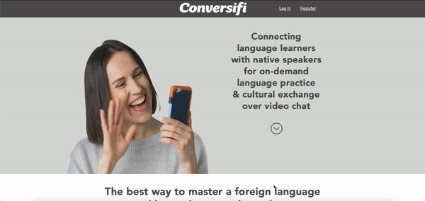
Conversifi Website Update
Created in Wix

Impact
The new update for their site has stronger branding and clearer visuals for accessibility.
Homepage
Instructor Site


Final Update and Branding
App Module Tile Design Sprint
Photoshop
Assignment
I was asked to design new tiles for their Conversifi app. These modules allow the user to choose different topics for discussion at a certain difficulty and context. I focused on user experience, composition, hierarchy and brand. I had 48 hours to get the design to coders with a clear way of communicating the design.
Before Update

Different Versions Presented


Best Version for the User Interface

Design Sprint
Reflection
This was a great experience, to be able to work on a UX/UI project for a real company from start to finish. I'm glad I got to recognize the problem, find a solution and execute the solution.
If I had more time with Conversifi, I would have loved to conduct more user testing. This would have allowed me to know the design was the best possible solution and continue to work on it.
For the design sprint, I wish I had the time to properly do a design sprint. I wrote out a design sprint assignment which I would follow in order to find the best possibly solution. This design sprint was inspired by my experience with the Google UX Certificate. A structure like this with other designers would have given me a better idea if the design was successful or needed to be worked on further.
Reflection
bottom of page